A Study of Relative Wealth in the US
Statistical analysis and visualization in R
Introduction
We see it in the outsized fortunes of high visibility billionaires like Jeff Bezos and Elon Musk; we feel it in the grocery checkout line and when we make our housing payments.
The distance between owners of capital and those who labor for income seems to be expanding.
Is it actually true, though?
Data science can help translate our intuitions into a better understanding of the world around us. Let’s start by exploring the data.
The Data
To get a better look at the realities of economic inequality, I have gathered several data sets.
From the World Inequality Database (WID), we have two sets that describe the same underlying data using different units. This data describes the following groups from most to least wealthy:
- Top 1% - the 99th to 100th percentile of the net wealth distribution
- Top 9% - the 90th to 99th percentile
- Middle 40% - the 50th to 90th percentile
- Bottom 50% - the 0 to 50th percentile
WID_wealth_share_percent.csv
This is the wealth share percentage for the four percentile groups over time.
- Column 1: Year (1965 – 2023) / Categorical
- Column 2: Top 1%, Percent Share / Numerical
- Column 3: Top 9%, Percent Share / Numerical
- Column 4: Middle 40%, Percent Share / Numerical
- Column 5: Bottom 50%, Percent Share / Numerical
WID_wealth_share.csv
This is the average net personal wealth for the same four groups.
- Column 1: Year (1965 – 2023) / Categorical
- Column 2: Top 1%, Constant 2023 Dollars / Numerical
- Column 3: Top 9%, Constant 2023 Dollars / Numerical
- Column 4: Middle 40%, Constant 2023 Dollars / Numerical
- Column 5: Bottom 50%, Constant 2023 Dollars / Numerical
Source for both: World Inequality Database: Interactive chart specified by me, https://wid.world/country/usa/ / Original: Saez, E., Zucman, G. (2020), The Rise of Income and Wealth Inequality in America: Evidence from Distributional Macroeconomic Accounts
Wealth Share by Group as a Percentage
Let’s take a look at this data, beginning with the wealth share as a percentage (Fig. 1):
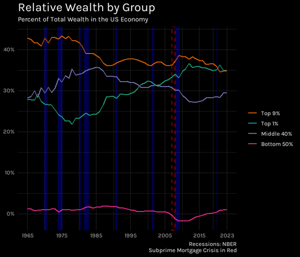
Figure 1
The orange line, representing the Top 9%, consistently stays highest, indicating this group holds the largest single share of net wealth throughout the period. In general, these are high earning professionals, managers, and business owners who also hold substantial capital in the form of stocks and business equity. 9% of the population holding close to 40% of the wealth is significant. Shifts mentioned later are visible here: starting around the 1980s, observe the downward slope of the orange line (Top 9%) and the purple line (Middle 40%), contrasting with the clear upward trend of the green line representing the Top 1%, which crosses above the Middle 40% line in the late 1990s. The pink line, representing the Bottom 50%, remains nearly flat and close to zero, reflecting their minimal share of total wealth. Worse, there is a distinct dip below zero around 2008-2010 (marked by the red dashed line). This is the Subprime Mortgage Crisis, which wiped out the value of the primary asset held by the less wealthy half, leaving them with net debt.
Average Wealth per Person in Each Group
Visualizing the average net personal wealth per person in each group (Fig. 2), the scale of inequality becomes more apparent. Look at the green line (Top 1%): it starts out higher than the others and its upward slope accelerates dramatically at the end of the 1980s, ending above $17 million per person. In contrast, the lines for the Top 9% (orange), Middle 40% (purple), and Bottom 50% (pink) show much flatter trajectories, clustered near the bottom of the graph. This visual gap underscores not only the vast difference in average wealth but also the accelerating divergence between the Top 1% and everyone else over time.
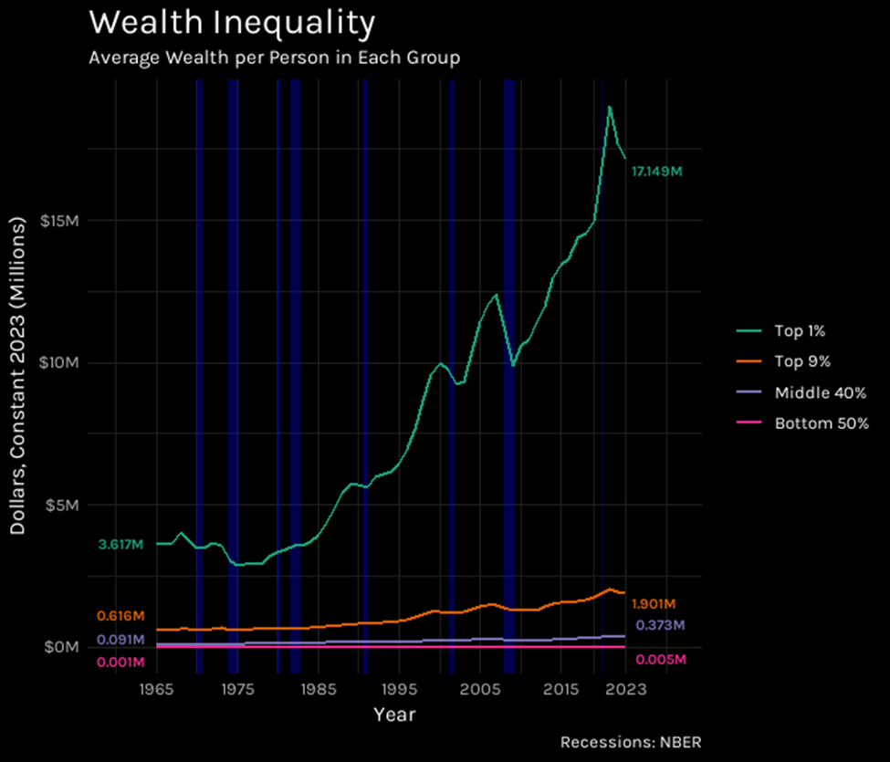
Figure 2
Wealth Density by Group
For another perspective on the wealth share percentage data, we can take the total percentage share of wealth held by each group and divide it by the size of that group in percentile points (1, 9, 40, or 50 respectively).
This normalization allows for a direct comparison of wealth density within each group, controlling for group size (Fig. 3). The most striking feature is the green line (Top 1%), far above the others and trending upwards, indicating a large and growing concentration of wealth within this single percentile. Compare its height (reaching over 35% share per percentile point) to the orange line (Top 9%), which hovers consistently around 4-5%. This visual gap highlights that wealth concentration in the Top 9% is roughly 6 to 8 times less intense than in the Top 1%. Note also the relatively flat trajectory of the orange line (Top 9%), as opposed to the upward slope of the green line (Top 1%). Observe as well the noticeable dips in the green line during recessionary periods (marked by blue bars), reflecting the sensitivity of top-tier wealth (often held in financial assets) to economic downturns.
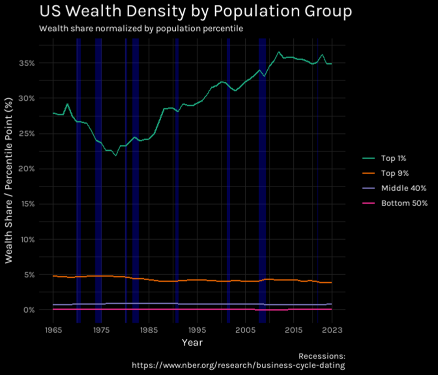
Figure 3
The Great Divergence
Next, we will explore historical factors that help explain the divergence in relative wealth observed between the top and bottom economic levels during the latter part of the 20th century. The mid-1970s was a turning point in the economy, characterized by the following:
End of the Post-War Boom & Stagflation: The period leading up to and including the mid-1970s marked the end of the relatively stable post-WWII economic expansion (sometimes called the “Great Compression” or the era of “managerial capitalism”). The US economy entered a difficult period known as “stagflation” – a combination of stagnant economic growth, with high unemployment and inflation. This was fueled by factors like Vietnam War spending, Great Society programs, and the 1973 OPEC oil embargo which quadrupled oil prices.
End of Bretton Woods: The fixed exchange rate system collapsed between 1971 and 1973, leading to floating currencies, increased global financial uncertainty, and devaluation of the dollar.
Early Governance Focus: While a major shareholder value push came later, the 1970s saw some early shifts. Scandals like the Penn Central bankruptcy led to increased scrutiny of boards of directors in the US. The SEC prompted reforms like requiring independent audit committees on the NYSE. Institutional investors (like pension funds) were also beginning their rise, concentrating share ownership.
Changes in Corporate Compensation Philosophy: While stock options weren’t dominant yet, the difficult economic environment (stagflation, low corporate earnings) and the instability of managerial capitalism applied pressure to find ways to better align management incentives with firm performance. This is likely the foundation for the performance-based (and later stock-heavy) compensation structures that became dominant in the 1980s and 1990s. The shift toward emphasizing shareholder value, often cited as starting in the late 1970s, was likely brewing in this challenging period.
The following chart allows us to visualize the trends of our major indicators prior to indexing (Fig. 4):
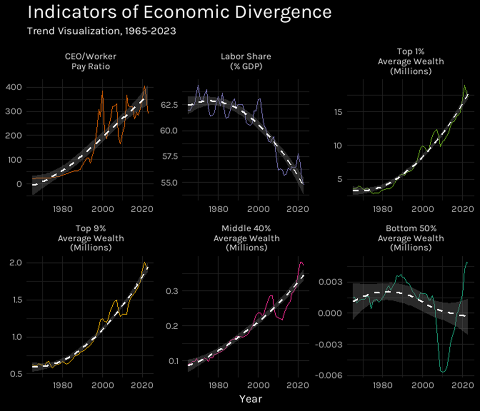
Figure 4
Here we need to describe the two new data sets we have introduced:
CEO-to-worker pay ratio.csv
The CEO pay ratio is average annual CEO compensation divided by average private-sector production and nonsupervisory worker compensation (measured as wages and benefits on a full-time, full-year basis).
- Column 1: Year (1965 – 2023) / Categorical
- Column 2: Ratio (CEO Pay ÷ Worker Pay) / Numerical
Source: Economic Policy Institute, State of Working America Data Library, “CEO pay ratio - CEO-to-worker pay ratio, realized,” 2025.
labor_share_BLS.csv
The labor share is the percentage of economic output that accrues to workers in the form of compensation. The specific population of workers in this measure is “All workers – Nonfarm Business Sector”.
- Column 1: Year (1965 – 2023) / Categorical
- Column 2: Percentage / Numerical
Source: Bureau of Labor Statistics, Office of Productivity and Technology. I derived this data set from labor-productivity-major-sectors.xlsx, which includes much more related data. For most of the data sets used in this project, there is data for other years, but as 1965 – 2023 was the time range common to all, it was the one used.
Now let’s visualize these indicators indexed to 1965 (Fig. 5) to directly compare their relative change over time. The most noticeable feature is the orange line representing the CEO-to-worker pay ratio. Observe its dramatic upward trajectory, starting near the 100 baseline and soaring to peaks near 2,000, ending the period roughly 14 times higher than it began. Contrast this with the relatively flat purple line representing labor’s share of GDP, which drifts slightly downwards below the 100 baseline. The wealth shares of the Top 1% (green), Middle 40% (pink), and Top 9% (yellow) show varying degrees of increase, all significantly less dramatic than the CEO pay ratio, while the Bottom 50% (teal) dips significantly, especially after 2008. Key inflection points are visible in the orange line: note the initial climb starting in the late 1970s/early 1980s following the first red dashed line, and the sharp peak and subsequent drop corresponding to the dot-com boom and bust from the mid-90s to 2000.
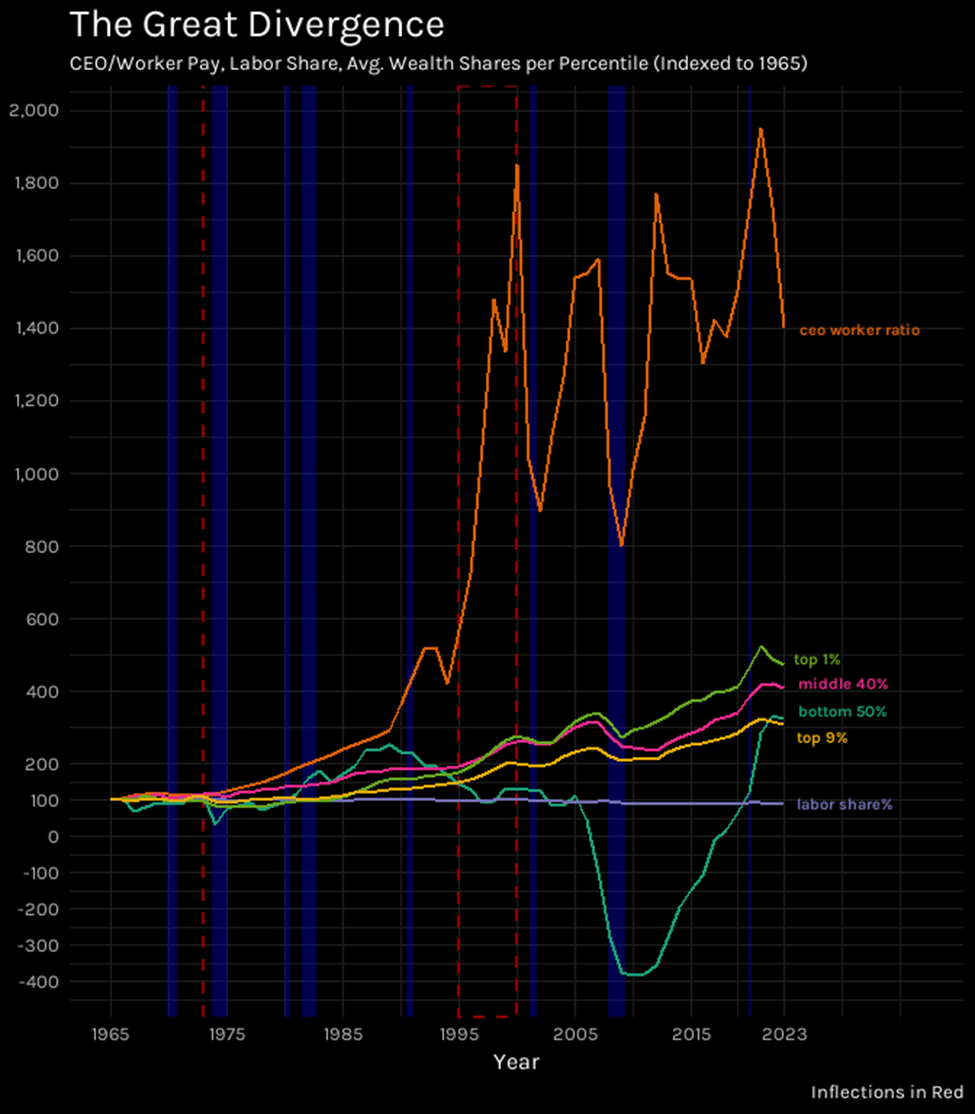
Figure 5
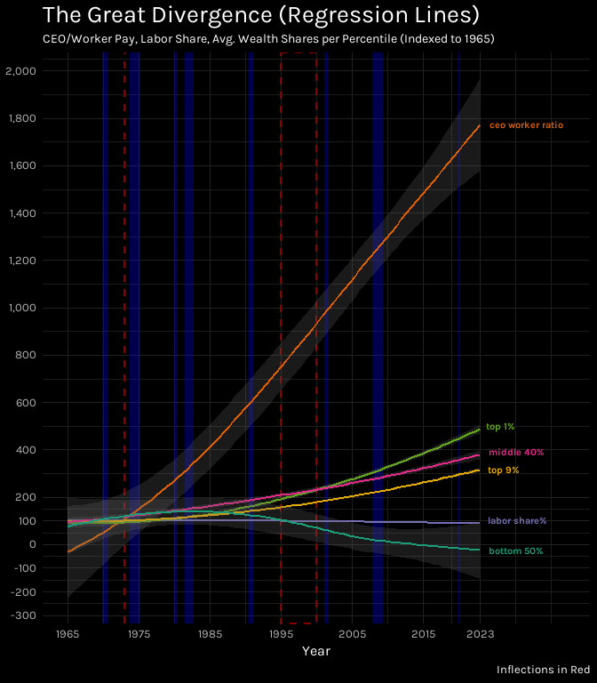
Figure 6
Figure 6 presents the same indexed data as Figure 5 but uses smoothed LOESS regression lines to clarify the underlying long-term trends by reducing the visual noise from short-term volatility. The steep, persistent upward slope of the smoothed orange line (CEO-worker ratio) becomes clearer, alongside the slight downward slope of the purple line (labor share). The general upward trends for the Top 1% (green), Middle 40% (pink), and Top 9% (yellow) wealth shares are also more evident, as is the declining trend for the Bottom 50% (teal). The shaded areas around each line represent confidence intervals; note the particularly wide interval around the volatile CEO pay ratio line, reflecting the uncertainty or variability in that trend compared to the others.
The Great Divergence, Part 2
We have seen that CEO compensation has skyrocketed relative to labor’s share of GDP, but what has so far gone without mention is that the labor share does not take into account the growth of the labor cohort. Figure 7 provides another perspective on the divergence by indexing GDP, Labor Population, Labor Share, and a calculated ‘Labor Share per Employee’ metric to 1965. The dramatic upward climb of the green line (GDP) shows significant economic growth (over 400% increase). The orange line shows the Labor Population also grew substantially, though less steeply (around 156%). Contrast these with the purple line (Total Labor Share), which, as seen before, drifts slightly downward (-12%). The insight comes from the pink line (Labor Share per Employee), calculated by dividing labor’s share by the growing labor force. Notice its persistent downward trajectory, ending roughly 66% below its 1965 level. This starkly illustrates that while the overall economy (GDP) grew immensely and the workforce expanded, the average portion of economic output accruing to each worker significantly declined.
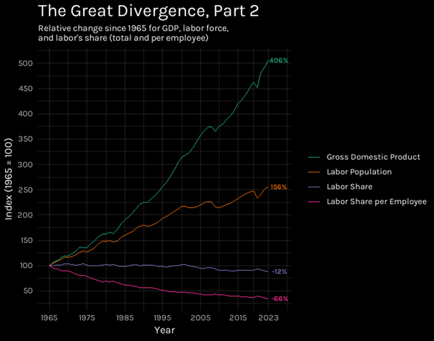
Figure 7
Note: Labor Share per Employee is calculated by dividing the percentage labor share by the labor population and then indexing the result to 1965 = 100. It represents how much of the national income pie (the labor share portion) is associated, on average, with each worker in that group for that year.
Additional data sets used in Fig 7:
all_employees_thousands_total_nonfarm_not_seasonally_adjusted.csv
The specific cohort used in the BLS labor share. The original data had monthly data, which I averaged to yearly data.
- Column 1: Year (1965 – 2023) / Categorical
- Column 2: Average Labor Cohort, 1000s of Employees / Numerical
Source: Bureau of Labor Statistics, https://www.bls.gov/webapps/legacy/cesbtab1.htm
real_GDP_chained_2017.csv
- Column 1: Year (1965 – 2023) / Categorical
- Column 2: GDP, Billions of chained (2017) dollars / Numerical
Source: U.S. Bureau of Economic Analysis, “Table 1.1.6. Real Gross Domestic Product, Chained Dollars”
Infographic: Division of Wealth
One final and very stylistically different visualization to illustrate the divide between wealth at the top of the economy and the lack of it at the bottom:
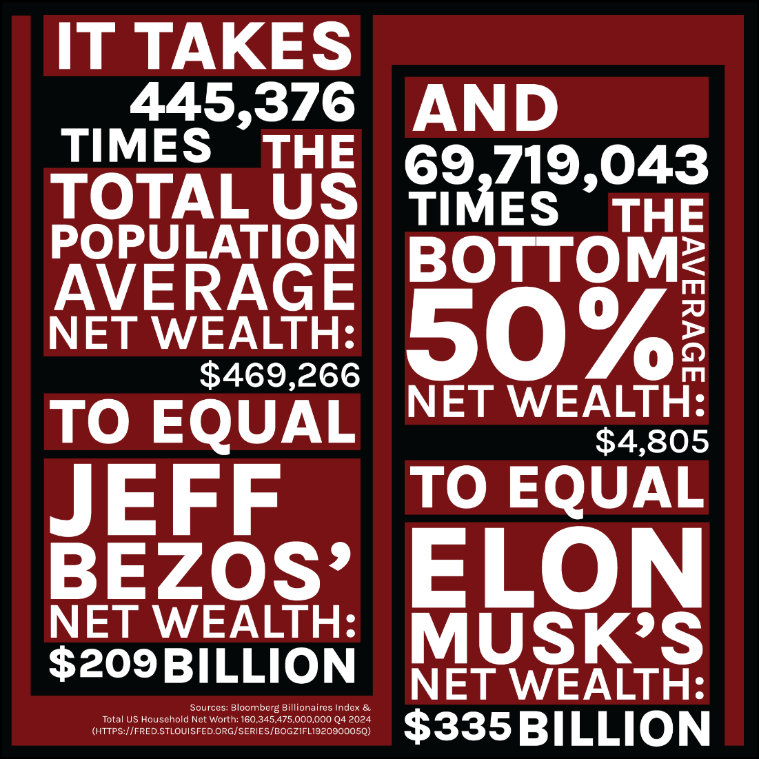
The differences are staggering
Sources: Bloomberg Billionaires Index. Total US Household Net Worth: $160,345,475,000,000 as of Q4 2024 https://fred.stlouisfed.org/series/BOGZ1FL192090005Q , graphic by me.
Conclusion
Our intuitive sense that economic inequality is massive and increasing is supported by the data. More research is needed to discover causative factors and for a precise understanding of the negative effects, leading hopefully to their alleviation or mitigation.
What is known is that economic inequality in the United States is linked to a wide range of economic, social, and political consequences:
Economic Consequences
- Slower Economic Growth
- Concentrated wealth can reduce overall demand in the economy because wealthier households tend to save a larger portion of their income compared to lower- and middle-income households, who spend more of their income on immediate needs. A shift in spending power can drag down aggregate demand and slow overall economic growth. Some estimates suggest that rising inequality slowed demand growth by 1.5-2% of GDP annually in recent years prior to 2022.
- Financial Instability
- Some theories suggest high levels of household debt can increase vulnerability to financial crises and lead to longer recessions. High inequality was a backdrop to the 2008 financial crisis.
- Reduced Investment in Human Capital
- Inequality of opportunity, often linked to wealth inequality, can mean that those with less initial wealth face barriers (like credit constraints) to investing in education or starting businesses, hindering overall economic potential and productivity.
Social Consequences
- Reduced Social Mobility
- Higher levels of wealth inequality are often correlated with lower intergenerational economic mobility, meaning children from poorer backgrounds have less chance of moving up the economic ladder. Wealth is often passed down, giving subsequent generations significant advantages.
- Health and Social Problems
- Research suggests that more unequal societies tend to experience higher rates of various health and social problems, including lower life expectancy, higher rates of infant mortality, obesity, mental illness, homicide, and imprisonment.
- Erosion of Social Cohesion and Trust
- Higher inequality is linked to lower levels of social trust between people, reduced community involvement, and less civic participation.
- Unequal Access and Opportunity
- Wealth disparities often result in unequal access to high-quality education, healthcare, and safe housing, limiting opportunities for disadvantaged groups.
- Exacerbated Disparities
- Existing racial and ethnic wealth gaps can be widened by factors contributing to overall inequality.
Political Consequences
- Increased Political Polarization
- Rising income and wealth inequality are seen as contributing factors to increased political polarization, potentially making consensus and effective governance more difficult.
- Unequal Political Influence
- Wealth can be translated into political power through campaign donations, lobbying, and media ownership, potentially leading policymakers to be more responsive to the preferences of the wealthy than the broader population. This can create a feedback loop where policies favor the wealthy, further increasing inequality.
- Erosion of Democratic Norms
- Some research suggests high economic inequality can erode trust in democratic institutions and is statistically associated with democratic backsliding or erosion, potentially by fueling grievance and polarization that populist and/or authoritarian leaders can exploit.
- Policy Outcomes
- High inequality may lead to political pressure for or against certain types of policies (e.g., debates around taxation, social spending, regulation) that reflect the diverging interests of different economic groups.
In summary, high inequality is not just an economic outcome but a factor with potentially far-reaching negative consequences for economic stability and growth, social cohesion and opportunity, and the functioning of democratic processes.